A web-based, interactive map of Wisconsin coastal data that enables users to visualize the temporal changes to Wisconsin’s shorelines.
Wisconsin Shoreline Inventory & Oblique Photo Viewer
Featuring NEW photos from 2024
Overview
The Wisconsin Shoreline Inventory and Oblique Photo Viewer is a web-based, interactive map of Wisconsin coastal data that enables users to visualize the temporal changes to Wisconsin’s shorelines. It has recently transitioned to a new platform that utilizes ArcGIS. For more information on navigating the updated site, see the images below. The site has also been updated with oblique photos from 2024. Additionally, this map contains measurements of bluff recession data (from 1956 to 2015) which provides both a qualitative and quantitative inventory of shoreline conditions on Wisconsin’s Great Lakes coasts. Geolocated aerial photos and shoreline condition inventories allow users to view images from different years side-by-side to visualize coastal change. Lake Michigan coastal bluff and shoreline recession information is provided for Southeastern Wisconsin (for more information on recession mapping, see our Bluff Recession Measurement Report).
Navigating the Updated Site’s Layout
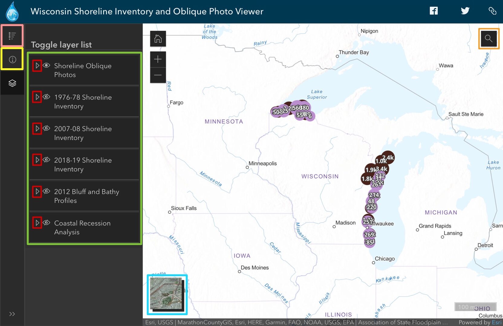
As you open the viewer, you will see a map of Wisconsin with some default data visible on the Lake Michigan and Lake Superior coastlines. Reference the image below to orient yourself to the viewer. You will see the different data layers that are available for viewing
You can expand the layers by clicking the drop-down arrows boxed in red. The layer legend is available by clicking the “list” icon boxed in pink. A search bar is available by clicking on the magnifying glass button on the top right of your screen (boxed in orange). This allows you to search any location in the study area and the map will zoom to that area. The base map button, boxed in blue on the bottom of your screen, allows you to change to a satellite view. The information button, boxed in yellow, brings you to the details tab which provides a summary of the data and links to find additional information.
Viewing Oblique Photos
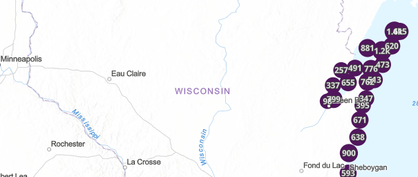
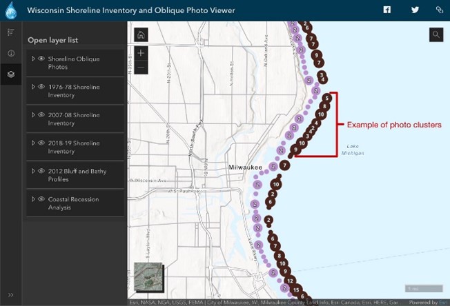
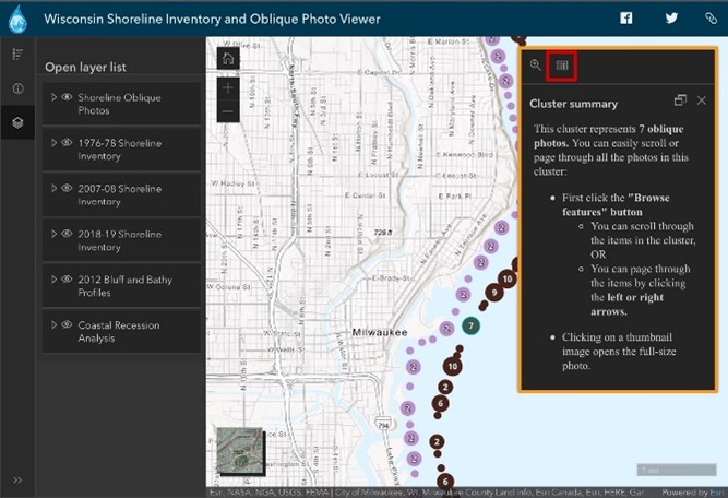
The Viewer provides photographs from 1976 – 2024. The images of Lake Michigan, just north of Milwaukee pictured below are examples of the oblique photos available on this map. To turn on or off each photo layer, you can click the “eye” button. The icon boxed in red is turned off, and the icon boxed green is a layer that is turned on. The purple and black dots you see boxed in red are photo clusters. As you zoom in, the dots start to get smaller and separate. If the dot has a number on it, that means that it is a photo cluster. If the dot does not have a number, this means it is an individual photo.
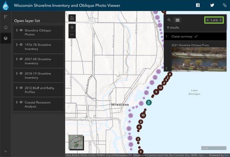
If you are looking at a photo cluster, you will need to follow a couple steps. First, it will be easier to view the photos if you dock the pop-up (click the button boxed in orange). Then, you will click the browse features button boxed in red. It is recommended that you dock the pop-up first, and then click the browse features button.
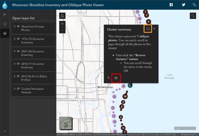
Once your page looks like the right image above, you can begin scrolling through the images by swiping up and down on a touchscreen or using your mouse wheel. You can also search through the photos by using the arrows boxed in green.
By turning on and off layers, you can compare images of the coastline over years. Overall, the photos can be a valuable tool to quickly see coastal conditions and visualize coastal change over time.
The beach protection layer under the “inventory” layers shows you whether the shoreline has some sort of armoring or protection. Looking at the legend, the grey “none” line indicates that a stretch of coast is unarmored with a natural beach. The red line indicates that the coastline is protected by a public marina. You can click on the line to learn more about its classification. Details include things like segment length and shore type. Overall, these “inventory” layers can give you a snapshot of some important coastal characteristics at specific points in time, allowing you to quickly take stock of coastal conditions, compare areas of the coast, and identify places you may want to look at in more detail.
Viewing Bluff and Bathy ProfilesThe Viewer provides Bluff and Bathy Profiles. To access this data, you can turn on the 2012 Bluff and Bathy Profiles Layer. Within this layer there are two types of profiles: Bluff Profile Transects and Bathymetric Profile Transects.When turning on the Bluff Profile Transects layer, brown lines perpendicular to the coastline appear along the coast of Lake Michigan. When you click on a line, the Bluff profile layer appears. This provides a graph of the elevation vs distance of the bluff. If you dock the pop-up and click on the photo, addition information appears below the graph.When turning on the Bathymetric Profile Transects, blue lines extending out from the coast appear along the coast of Lake Michigan. Once you are zoomed in close enough, the lines are no longer clustered, and you can click on an individual line. Upon clicking on the line, the Bathymetric profile appears which provides data about the depth of Lake Michigan. If you dock the pop-up and click on the photo, addition information appears below the graph.
Viewing Coast Recession Analysis Data
The Viewer also provides bluff and shoreline recession information in Southeastern Wisconsin which includes Kenosha, Racine, Milwaukee, and Ozaukee Counties. Recession is the distance the bluff or shoreline has moved back from the water landward, primarily due to erosion.
The layer legend indicates that the color of the dot represents the total distance the bluff crest has moved over the 59-year measurement period. The deep blue color you see indicates the top of the bluff has moved over 60 feet in that time-period, while the lighter colors show areas that have moved less. If you click on a point, it will bring up the actual measurement values of the bluff’s movement.
You can also see how things have changed over a shorter-term period from 1995-2015 by turning on the “Short-Term Recession” layer. This information helps you better understand where and how much the bluffs and shorelines have receded in the past. That data can be used as a basis for prioritizing areas that need attention and inform possible scenarios of future recession so you can better plan and manage coastal areas and properties.
The Wisconsin Shoreline Inventory and Oblique Photo Viewer is designed to help users better understand Wisconsin’s Great Lakes coastlines and how they’ve changed over time. It’s intended for anyone to use including decision makers, planners, managers, and property owners,
Try it out for yourself here, happy exploring!
Note: If you are struggling to turn on/off layers, first make sure that the parent layer is on, then check the sublayers. For example, if you are trying to see the 2020 Shoreline Photos, first make sure that the parent layer “Shoreline Oblique Photos” is on, then check that “2020 Shoreline Photos” is on as well.